Showing posts with label interior decoration. Show all posts

Friday, March 27, 2009

Casulo modular furniture


It might not look like it, but inside this box, there's an armoire, a desk, a height-adjustable stool, two more stools, a six-shelf bookcase, and a bed with a mattress. Casulo, the brilliant, modular setup designed by Marcel Krings & Sebastian Mühlhäuser, hides furnishings enough for an entire room -- or, heck, an entire apartment -- in a small 31"x47" (that's 80 cm x 120 cm) box. Two people can lift, carry, and assemble (and then disassemble, when it's time to move) each piece of furniture within the Casulo in about 10 minutes -- it requires no tools for assembly -- and every part of the boxy exterior is used, negating any need for extraneous, wasteful packaging. Smart.

Casulo won the "Abraham & David Roentgen Award" in November 2007 for its "cleverness, finesse and qualitative realisation of the idea" and we think it's quite well-deserved; what a perfect solution for frequent movers and small space dwellers alike. More pics, plus a video, of the unboxing process, after the jump. ::Casulo via ::DesignSpotter


Friday, March 13, 2009

Color cool out


Blues, greens, violets and their intermediates are considered cool colors because of their references to pastoral landscapes and ocean vistas. When we look at these colors they elicit feelings of peace, tranquility and relaxation.

Blue
Soothing blue is an ideal bedroom color choice for adults and children. But that same blue that lulls us to sleep also suppresses our appetites, possibly because there are very few naturally blue foods. Put blue to bed, but try and keep it out of the dining room.

Green
As the dominant color in nature, we are at home with green anywhere in the house. Light greens work well in baths and living rooms; mid-range greens are a great accent for kitchens and dining rooms. The calming effect of green makes it popular in hospitals, schools and work environments.

Violet
Despite the favorable response violet elicits in children, many adults dislike purples, with rosier shades of violet being somewhat more appealing. Children's bedrooms and play areas may be good places to experiment with this color family.


(Via Paint Quality Institute)

Monday, February 23, 2009

Toss that toxic couch


Whether you're a design junkie who obsesses over every piece of furniture in the house or a low-maintenance IKEA type, there's no question that the surfaces on which you sleep, eat and lounge are a big part of your everyday life. And like most choices we make, the furniture that fills our home not only affects our comfort levels, but also has an impact on the environment and our health.

There are many good reasons to seek out green furniture: Keeping excessive manufacturing waste out of landfills; saving endangered forests; and improving indoor air quality by reducing the use of toxic chemicals are a few of the big ones. And as innovative designers become increasingly tuned in to the desires of the consumer who is as style savvy as she is environmentally conscious, options abound for outfitting your pad with supremely cool gear that doesn't forget the planet.

Sound too good to be true? Economically, it may be. Though rapidly growing, green design is still a relatively small segment of the furniture market, which often results in hefty price tags for even simple pieces. The solution? Start slowly.

Just as it's impossible to instantly transform every piece of your wardrobe into organic cotton, it's unrealistic to quickly fill your home with furniture crafted from sustainably harvested wood. While you're saving up for the big-ticket items like the Isabella Bed from RC Green — made from Forest Stewardship Council (FSC)-certified wood and natural latex — you can score furniture that is eco- and wallet-friendly by seeking out previously owned pieces. Reusing is always the greenest option as it doesn't require new materials or the energy required for manufacturing, and it keeps another item out of the landfill. You can go the craigslist.org or freecycle.net route or you can hunt for vintage and antique items.

But if you've got the green to purchase new green pieces, keep these tips in mind as you shop:

  • Look for furniture made from reclaimed materials. Houses, kitchen tables, pianos, baseball bats — think of all the wood that is used to make things each day and then think about all the scraps left over from construction and manufacturing and the landfill waste from discarded wood items. Instead of using new wood to make dining room chairs and beds and bookshelves, some green designers are turning to wood that's already in play. NYC-based RG Furniture Design turns lumber from historic buildings under demolition in New York City into striking tables, benches, shelves and lamps.
  • Seek out furniture made from FSC-certified wood. We need trees. Lots of them. They produce oxygen, absorb carbon dioxide, and help to keep the planet cool, among several other very commendable attributes. Purchasing furniture made from wood sourced from sustainably harvested forests helps to ensure that many trees will be with us for a long, long time. The Forest Stewardship Council is the biggest certifier. Look for its seal of approval before investing in an eco-friendly piece of furniture. Check out Woodshanti's stunning FSC-certified computer desk.
  • Purchase furniture made without toxic chemicals. Your couch may look harmless, but unless you know exactly how it was manufactured, there's a good chance that it's off-gassing (emitting substances into the air) harmful chemicals into your home. The most common off-gassed substances are VOCs, or volatile organic compounds, which actually sound as scary as they are — they've been connected to cancer and birth defects — and can be found in substances like formaldehyde, flame retardants, finishes, adhesives and foam cushions. Check out the Brave Space Hallow Coffee Table with low VOC adhesives and a nontoxic finish.
(via Newsweek)

Monday, February 16, 2009

Green bathroom makeover


The bathroom is where 60% of the water used indoors gets consumed. That makes it the perfect place to start saving water.

Tuesday, January 13, 2009

Likeable living rooms


More often used for family relaxation than formal entertainment, today’s living rooms reflect comfortable, stylish spaces. An ideal location to highlight a unique decorating "persona", color choices for living rooms can be as bold or relaxing as the individual preferences of the homeowner.

Decorative Paint Techniques: Techniques that are utilized in
living room spaces demonstrate a homeowner’s preference for
added texture, color and style (see Decorative Techniques).

• Utilizing a "Combing" or "Dragging" technique, for instance on one representative accent wall that is within in a small, square living room area can lend the illusion of added length and space.

• Consider decorative techniques that provide fabric like appearances such as leather, suede and silk to impart an elegant appearance for living rooms that portray a formal air.

• Denim, chambray and chenille fabrications can also be
achieved through the use of decorative paint techniques for the more casually styled living room space.

• Consider adding distinctive flair to the living room space by incorporating color by means of painted picture frames used as decorative accents, painted "faux" fireplaces add ambiance and charm, or contrasting painted moldings and trim within the living room space.

(via PQI)

Tuesday, December 9, 2008

What the best paint to use on baby crib?


I reglued a crib for a friend and she wants to paint it white and asked me what was the best paint to use, so I'm asking for help

You should use what is called Milk Paint. It's non-toxic and is always recommended for toys/cribs that kids might put in their mouths. It actually has a dairy product as one of its ingredients.

Besides, it's beautiful paint because the colors are soft on the eye. Gives a country look. In the 1700s and 1800s, it was used to paint houses. Check out Woodworker.com. They sell it there. Just do a search under "milk paint". You'll see a brand called "J.E.Moser's Old-Fashioned Milk Paint". Get that one.

(via thebabycribsite.com)

Monday, November 17, 2008

Feng Shui bedroom tips

Creating a balanced, comfortable bedroom is one of the most important things you can do in your home. Use these feng shui tips to arrange a safe haven in your bedroom.

Wednesday, November 12, 2008

The psychological effects of color


Colors, like features, follow the changes of the emotions. - Pablo Picasso

What Is Color?

In 1666, English scientist Sir Isaac Newton discovered that when pure white light is passed through a prism, it separates into all of the visible colors. Newton also found that each color is comprised of a single wavelength and cannot be separated any further into other colors. Further experiments demonstrated that light could be combined to form other colors. For example, red light mixed with yellow light creates an orange color. A color resulting from a mix of two other colors is known as a metamer. Some colors, such as yellow and purple, cancel each other out when mixed and result in a white light. These competing colors are known as complements.

Color Psychology - The Psychological Effects of Color

While perceptions of color are somewhat subjective, there are some color effects that have universal meaning. Colors in the red area of the color spectrum are known as warm colors and include red, orange, and yellow. These warm colors evoke emotions ranging from feelings of warmth and comfort to feelings of anger and hostility. Colors on the blue side of the spectrum are known as cool colors and include blue, purple, and green. These colors are often described as calm, but can also call to mind feelings of sadness or indifference.

Color Psychology as Therapy

Several ancient cultures, including the Egyptians and Chinese, practiced chromotherapy, or using colors to heal. Chromotherapy is sometimes referred to as light therapy or colourology and is still used today as a holistic or alternative treatment. In this treatment:
  • Red was used to stimulate the body and mind and to increase circulation.

  • Yellow was thought to stimulate the nerves and purify the body.

  • Orange was used to heal the lungs and to increase energy levels.

  • Blue was believed to soothe illnesses and treat pain.

  • Indigo shades were thought to alleviate skin problems.
Most psychologists view color therapy with skepticism and point out that the supposed effects of color have been exaggerated. Colors also have have different meanings in different cultures. Research has demonstrated in many cases that the mood-altering effects of color may only be temporary. A blue room may initially cause feelings of calm, but the effect will be dissipate after a short period of time.

Tuesday, November 11, 2008

The observation of color in nature to improve our design


To unleash the creativity of a designer, simply start observing your surroundings. Take a stroll through the park, what do you see? Trees, grass, water, ducks, leaves, flowers. That is what everyone sees but look a little closer, look with a designer mind. Look at the way the bark covers the tree trunk, observe the myriad of colors within one small piece, retrace the form, feel the texture and see how it contrasts to the smoothness of the leaves. Look how the sunlight can make the bark look different from when it is in the shade, observe the effect of shadow. You can use these observations to learn how color, light and texture work in the interior. Another example is a flower, look closely, there is often more that one color in a single flower, and it frequently goes by unnoticed. This simple use of juxtaposition means that the secondary color intensifies the main Another example - a pond of water, the shadows created by the clouds in the sky, the different depths of water, and once again the juxtaposition of other items in the pond combine to create a fantastic monochromatic scheme of blue/green. We need to slow down our hectic pace and deadlines that drive us to create without thinking and take the time to appreciate what is around us, this acts as our catalyst to design. How many times have you had a mental block and no matter which way you look, there seems no solution? Many! A simple stroll in the park can be all that is required to clear you head, get the blood moving around the body and gives you time to observe where design begins, at nature. Carry around a note book and jot down your observations, what colors look great together, how the different textures of similar items create a subtle design, how the light can highlight or obscure, how much of a different color do you need to make a statement, how a mass of wild flowers with hundreds of different colours can work together to form a subtle single entity, how the curved flowing lines of a Willow tree are softer than the brutal severe lines of a Pine tree. With these observations think how you would relate them back to your work, and how they can work in with people; after all we are the main reason for design, to create environments in which we can perform specific tasks comfortably.

(via Designerhelper)

Friday, October 17, 2008

Solid color versus paint


Probably one of the most confusing terms in paint is “solid color stain“. Not only does this confuse customers, but it confuses new paint store employees, too. So if you find yourself wondering what the difference is between solid stain and paint, then you are not alone.

Traditional stain refers to a pigmented oil that penetrates into the wood surface (like a dye). It is different than paint in that paint is a coating that doesn’t absorb into the wood, rather it is a coating that sits on top of the wood. Paint is a film that could peel whereas a penetrating stain could never peel.

But what is a solid color stain? In essence a solid color stain is an exterior coating just like exterior paint. In fact, solid stain basically is an exterior paint; very different than a penetrating stain (typically referred to as a semi-transparent or semi-solid stain). But solid stain does describe a certain type of exterior paint. Typically a solid stain is thinner than paint and as a result, has the advantage of showing more texture, being flatter and less likely to peel. On the other hand, it’s thinness means that is will not last as long and will need to be done more frequently.

The rule of thumb is that the solid stain will need to be done every 7 years, and redoing it will be a bit easier than if it were paint. On the other hand, paint will need to be done every 15 years and redoing it will be a bit more difficult due to its thicker film. The sold color stain will show more the the texture of the wood and be flat. The paint will typically have a low lustre and better fill cracks and be smoother.

Solid color stains come in either a siding stain for vertical surfaces and solid deck stain which are made to be walked on.

Saturday, October 11, 2008

Use of mirrors in Feng Shui

That gorgeous new mirror may look nice behind your bed, but it can hurt your feng shui. Find out where to put your mirror to help improve the energy and flow in your home.

Monday, October 6, 2008

Move to ban paints with lead content


Taking a serious note of the health hazards posed by lethal paints laden with lead, particularly to children, the global community has resolved to eliminate the noxious element from paints worldwide.


A resolution in this regard was adopted by the Intergovernmental Forum on Chemical Safety (IFCS), a body formed by United Nations Environment Program (UNEP).

The IFCS, which held its VI session at Dakar in Senegal, deliberated on issues in the area of sound management of chemicals.

"The resolution could prove to be an important milestone in the annals of chemical safety and management.

"It could result in setting up international standard for lead and eventual elimination of the element from paints which is deadly for children’s health, particularly the nervous system," said Ravi Agarwal, director of Toxic Link, an NGO which had moved the proposal.

"Noteworthy is the fact that the developed world had long ago replaced lead from paints with easily available lead-free alternatives such as titanium dioxide. Only a global effort can phase out the toxic element from paints in developing countries like India," he said.

The move would also pave way for the country to frame specific regulations, which at present are not adequate, Agarwal added.

Last year, Toxics Link had conducted a study on levels of lead found in various brands of paints available in India for household use and claimed to have found high concentrations of lead exceeding the globally accepted standards in all popular brands of paints, except for one.


(via Times of India)


Saturday, October 4, 2008

How to paint your interior walls

Tim Carter, of AsktheBuilder.com, demonstrates a few simple tricks when using a paint roller. Carter also talks about putting the right amount of paint on a wall surface.


Tuesday, September 30, 2008

Color trends for 2009


Color style for 2009 draws inspiration from both nature and nurture.
PQI has released a short video to demonstrate these exciting design directions, which highlight the 2009 color trends.

Tuesday, September 16, 2008

Luxury has become a hollow term


The term luxury has been completely abused in today’s context. Until two years ago, from a sari to an apartment to food was said to be minimalist with complete disregard for or a lack of understanding about whether what they portrayed was actually minimal or not. The same is now happening with luxury. It has become a hollow term.

Luxury was reintroduced into the international design world after years of it being dominated by minimalist style. It came as a sorbet to clean the palate of minimalism. It allowed people to see that they were able to reintroduce elements of design, such as ornamentation, back into their design ethos.


Luxury was meant to give people a chance to reinterpret their ethos in a more individual way than minimalism allowed. It led to a real loss of inhibition. But now, instead of moving beyond that transition point to a new design idea, everyone just throws their designs under the luxury blanket without even understanding what that term means.


Luxury is not just a price point; it’s not just a brand. Luxury is something that is not necessarily accessible, nor should it be. But people are doing the tackiest apartments with air conditioners stuck on the wall, straight-lined furniture, a few accessories—and calling it luxury. The worst part about it is that two years ago, the same design would have been called minimal. It’s just a buzzword people use to recycle the same poorly designed products, but packaged in a new term in an attempt to trick people into buying it. And people do because we’ve failed to create a strong design dialogue that helps explain terminology.


Before buying something labelled luxury or before labelling something luxury consider a few key points:

Does it fit your idea of beauty?

Is the quality truly impeccable?

Will it withstand the test of time?

Is it unique and worth waiting for?


(via Livemint.com)

Friday, August 29, 2008

How to choose the right interior paint finish


Even after a homeowner has chosen the perfect color for a room, there's another very important decision to make. With 5 or 6 paint finishes to choose from, you should learn the benefits of each and determine the right one for your job. Should you use flat or satin and why? Browse these tips on selecting the perfect paint finishes for your interior home applications.

Matte Finish
Whether called flat finish or wall paint, this type of interior paint has a matte surface. This paint finish is usually used on interior walls. It's expecially good if you have to camouflage small wall bumps, cracks, or other imperfections, as this finish does not reflect light. While some flat paints are advertised as washable today, you may need to touch up scratches or marks by covering with a bit more paint, so be sure you keep some on hand after you've finished painting.

Flat Enamel
Flat enamel is a paint with a durable flat, matte finish. It's a good choice for powder rooms and halls, as it holds up to occasional cleaning.

Eggshell Finish
If you can picture the very low sheen of the shell of an egg, you have an idea of how an eggshell paint finish will appear. With only a slight hint of shine or gloss, it's good for walls and holds up better with cleaning than a flat finish paint.

Satin Finish
Satin finish paint has a smooth, velvety look with a bit more gloss. It is most often used for windows, doors, trim, or ceilings, but can also be used as wall paint. This is particularly suitable for kids' room walls, kitchens, or bathrooms, or in areas which get a lot of traffic. Paint with a satin finish is formulated to hold up to cleaning and light scrubbing.

Semi-Gloss
Semi-gloss paint is most often used on doors, trim, and cabinets in kitchens and bathrooms. It is easily cleaned and lays down a nice, subtle shine, without being too glitzy. Take care with pre-paint preparation work, as poorly prepared surfaces can be a bit distracting when highlighted by a semi-gloss surface.

Glossy
High gloss paints have an almost reflective quality, as their shiny finish mimics the look of enamel or plastic. Though not widely used in home interiors, it is becoming more popular for a dramatic look on cabinets, trim, and furniture in very formal and very contemporary settings. This finish will magnify any surface imperfections, so careful preparation and sanding is essential before painting with high gloss paints.

Read more.

Saturday, August 23, 2008

How to create a color wash effect


Color Washing can be given a variety of textures and patterns depending on the size and type of brushes. Although this technique involves the application of one color over another, the final result would give an impression of a single color.

The thumb rule being that the glaze topcoat should be tinted in a much darker shade than the base coat.

You can create various shapes and patterns - wavy lines, crisscross strokes, and diagonal trellis designs, just by controlling the direction of the brush stroke.

Wednesday, July 30, 2008

Beyond Decoration


Educated in a monastery, poet, author and journalist P J Kavanagh’s early thoughts of becoming a monk were thwarted because he 'liked girls too much'. The Catholic influence though remains (he once appeared in Father Ted).


Kavangh said in an interview: ‘I want to express, without frightening the horses, that there is something about. It would be treason to deny it. Not something religious, that is a slippery word. Or spiritual. There is joy or hope. I think it's joy.’

The death of Kavanagh’s first wife, Sally, forms the backdrop to this poem’s description of finding grief mysteriously contained – and yet not removed. It is a wonderful, funny, poignant, but also hopeful piece about being met by this ‘something’.


Beyond Decoration

Stalled, in the middle of a rented room,
The couple who own it quarrelling in the yard
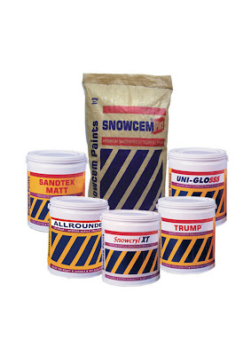
Outside, about which shade of Snowcem
They should use. (From the bed I'd heard
Her say she liked me in my dressing-gown
And heard her husband's grunt of irritation.
Some ladies like sad men who are alone.)
But I am stalled, and sad is not the word.
Go out I cannot, nor can I stay in,
Becalmed mid carpet, breathless, on the road
To nowhere and the road has petered out.
This was twenty years ago, and bad as that.
I must have moved at last, for I knelt down,
Which I had not done before, nor thought I should.
It would not be exact to say I prayed;
What for? The one I wanted there was dead.
All I could do was kneel and so I did.
At once I entered dark so vast and warm
I wondered it could fit inside the room
When I looked round. The road I had to walk down
Was still there. From that moment it was mean
Beyond my strength to doubt what I had seen:
A heat at the heart of dark, so plainly shown,
A bowl, of two cupped hands, in which a pain
That filled a room could be engulfed and drown
And yet, for the truth is in the bowl, remain.
Today I thought it time to write this down,
Beyond decoration, humble, in plain rhyme,
As clear as I could, and as truthful, which I have done.

(From Collected Poems, Carcanet Press 2001, and reproduced from here)